


During my second year of university, for the course "Visual Design Methodology 2" I developed the concept of a brand starting solely from a font: Garamond.
For this project, I want to thank Claudia Neri, my professor, who introduced me to the world of typography. I owe her a lot.
I was fascinated by these forms, so soft, classic, and refined. This project aims to be a tribute to classical typography and the explosion of a concept.
The letter that drove me crazy is undoubtedly the lowercase g, a masterpiece.

CONCEPT
To create a tribute to typography starting from a magazine. Each character has its own size, shape, positive and negative space, and it is right to valorize them.
A magazine aware of what it's doing, not afraid to stretch a character, to juxtapose two opposite styles, a brand that knows and is therefore vain, allowing itself to stand above all others.
The best typo mag.
These values are also perceived from the payoff which has a variable font, and will be the character of the first poster inside the magazine. In this case, we start from a very boring Impact font.


All this in a "pocket-sized" format, unusual for a normal magazine to appear in A5, the perfect size. Even the brand book is designed to be wearable, made with unusual elements, like construction hooks and ropes, post-its, and pen-made adjustments, because typography is always around the corner.

Məg*, the schwa is inserted because in everything that surrounds us, there can be the soul of the designer, just look closely.
The asterisk is a graphic element that is part of the project. There are always annotations, notes to be included, it is the digital transposition of the post-it. How many projects needed hundreds of post-its to see the light of day?
A bit like a small hedgehog trying to suggest something to you in a whisper.
100 pages enclosing in this brick 80 posters, 10 articles, 5 paper experiences (to try out new technologies) and 5 bullet pages, to express creativity to the fullest.
I thank the two Riccardos in my life for lending me their posters:
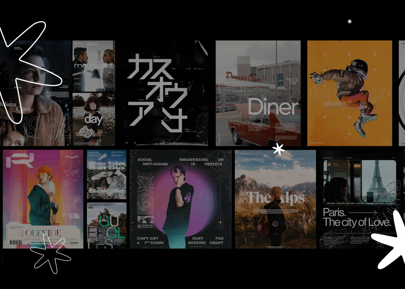
The main content will be the posters entirely managed by the community. In these contents, every typographic trend will be experimented without constraints and rules. Those who design these posters know they are the best typo artists.
Thanks to this interaction, it will be perceived how strong the typography-bound community is.
The so-called typo friends.

STATIONERY
The stationery explodes all the elements mentioned above into physical products.
Business cards have been made for the various figures within the team.
Envelope shows the detail of a stamp with the text "an email from the best typo mag"
Letterhead shows the marks to fold the sheet more easily in three. With this simple detail, we have the possibility to fold the sheet easily to insert it into the envelope.


A series of bags to carry around one's daily dose of inspiration.


A dotted notebook to give space to one's ideas, and a pencil, in collaboration with the best pencil for designers in my opinion, the Black Wing, so as to give life and shape to one's ideas.
The website (LINK) explode all the brand identity elements into a digital word. On the website you can read all the brand book, explore poster, and do everything you usually do on a website.
There are also some digital application for social media (like Instagram) or the mail signature.


2022
Thanks to:
Claudia Neri, Riccardo Cavallo, Riccardo Agostinelli, Nicolò Botticini, Elena Giugno


